

Mar 13, 2023
Next.js is a framework that sits on top of React and gives it superpowers. At its essence, it provides a number of pre-built functions, components, and solutions.
Vercel, the company that maintains the Next.js framework, provides this definition on their site:
“Next.js is a React framework that gives you building blocks to create web applications. By framework, we mean Next.js handles the tooling and configuration needed for React, and provides additional structure, features, and optimizations for your application.”
The awesome part of Next.js? Right out of the box, it helps you create scalable web applications that are SEO-friendly with good Google PageSpeed scores. Let’s look at some of the additional benefits…
Benefits
Client and server Rendering: This is a big one as it provides a flexible rendering and caching option.
Routing: Easy routing system (file structure).
Data fetching method: Custom data fetching method that can run on the server.
Built-in optimizations: Next.js provides custom optimized components that help boost performance like the image, script, and link components.
Typescript support
API routes: Build API endpoints to securely connect with third-party services to be consumed from your frontend.
Middleware: Run code before a request completes.
-
CSS support: Support for CSS modules.
Server-Side Rendering and Static Site Generation
This one is a big one, so let’s talk a little about it…
Server side rendering:
If a function getServerSideProps is present in a page, Next.js would pre render this page on each request with data coming from the server.
Runs: Always runs on server side, not on client side.
When: Ideally when you need to render data that could change constantly.
Static site generation:
If a function getStaticProps is exported on your page, Next.js would run this at build time (there are some tricks to run it again — sneak peek attribute revalidate).
Runs: At build time always on the server and not in the client
When: ideally for content that doest change that often. ex: blog posts
Next.js file structure
This is currently an interesting topic. One awesome thing about Next.js is the routing system. With Next.js 13, we get a glimpse of the direction they are heading with this.
The old and stable way
Any .js file inside the pages folder is converted automatically on a route, so if we need an “about” page, we can create about.js inside the pages folder and that should do the trick.
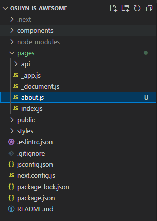
Yep, that’s it.
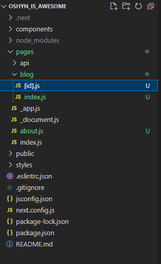
Dynamic routes are similar, but you need to name the file with square brackets and name it with the property it would be rendered. For example, imagine I want a blog landing page and also a per blog route. We need to create a folder named blog and place an index.js file inside it (this is going to be the /blog page ). For blog posts, we need to create a file like [id].js inside the blog folder and this resolves to /blog/12 like:
The new beta way
Next.js 13 now has an “app” folder and supports layouts out of the box (this is still in beta).
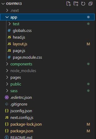
The idea is that in order to create a new page, you need a folder with the name of the route you want with a page.js file inside it that would be the render for that route. It seems a little bit tricky, but getting layouts is awesome, so I’ll stick to it.
Dynamic routes are the same, but instead of a file like this [id].js, you need a folder [id] with page.js inside it.
There are some benefits to using this approach:
-
Global layouts and per page too
-
Fetching data per component (wait, what?!!)
Remember, this is still beta, but we want to keep an eye on it.
Init basic project
Installing Next.js
To start a Next.js project you need to:
-
Create a parent folder in which your project will live.
-
Go to your terminal/cmd and navigate to your newly created project folder. Something like :
cd /Desktop/oshynIsAwesome/ -
Run this command:
npx create-next-app@latest
# or
yarn create next-app
# or
pnpm create next-app
or if you want to run it with typescript
npx create-next-app@latest —typescript
# or
yarn create next-app —typescript
# or
pnpm create next-app —typescript
File structure
This is your file structure. Basically, any page goes inside the pages folder and styles goes inside styles.
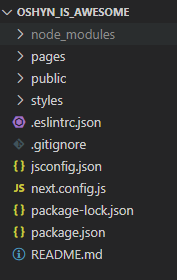
Let’s go a little deeper. Now, if you run npm run dev in your terminal, the magic will happen and you will see your first page:
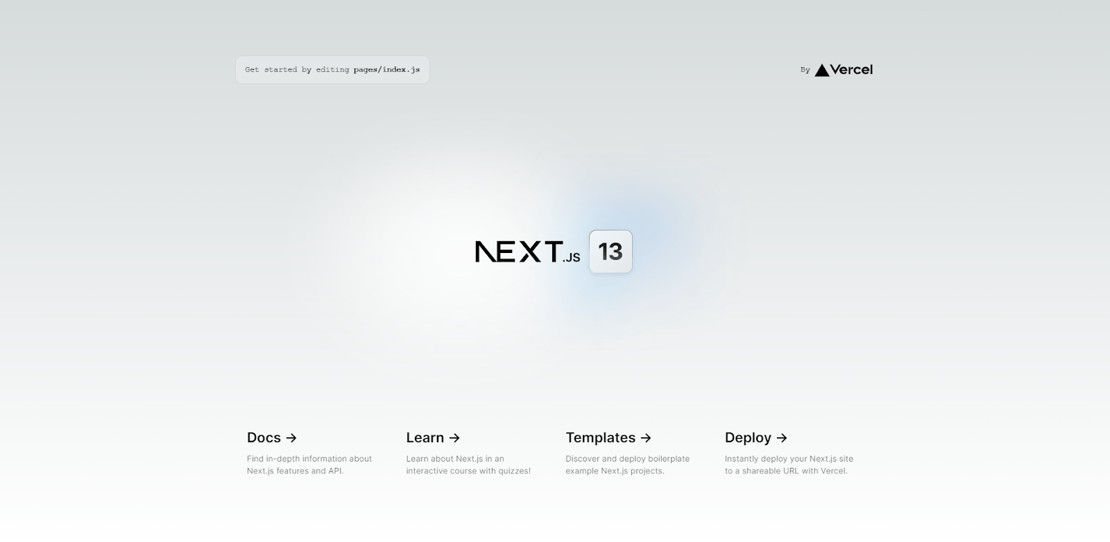
Voila. Next.js is installed and running!
Edit Homepage
Now, let’s edit the home page just a little. For this we need to open the pages folder and go to our index.js file.
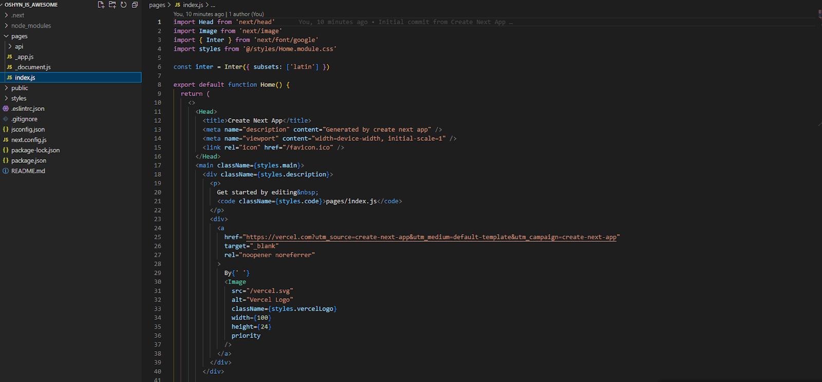
All of that code is what is rendering our home page, but let’s make it better.
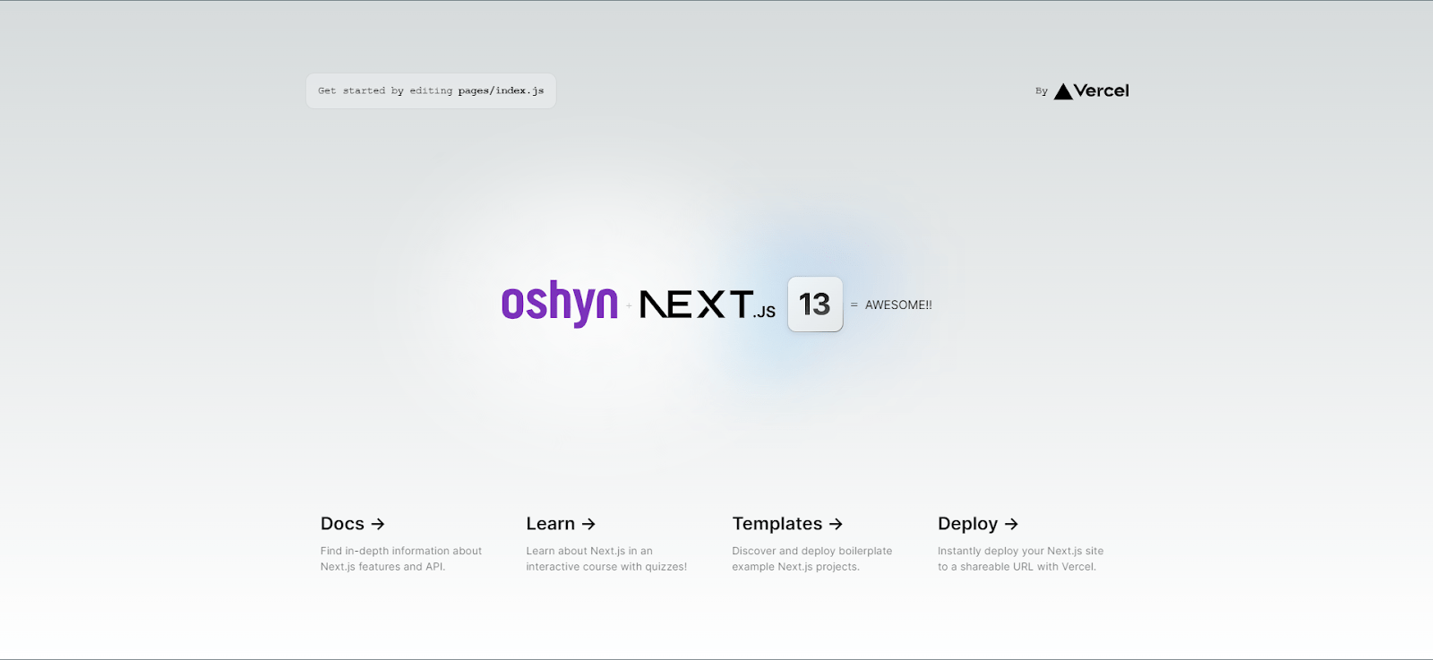
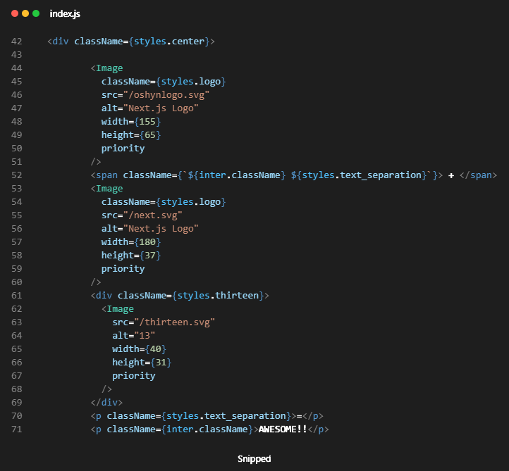
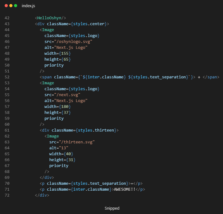
Nice!! It looks good. For this change to happen, I just added a new image component (courtesy of Next.js ) with the Oshyn logo SVG and added some spans for the ‘+’ and ‘=’.
Components
Create a Basic Component
Let’s create a component. For this we need to create a folder on the root called components:
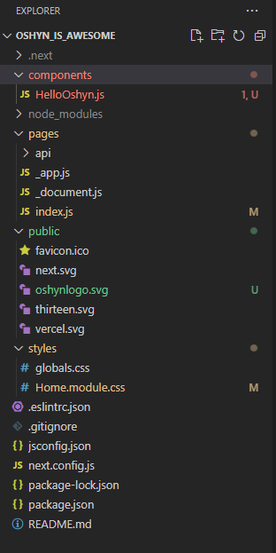
We are going to create a simple HelloOshyn component that will just say Hello Oshyn (Any similarity to a “hello world!!” is purely coincidental 😉 ).
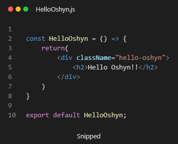
To create a component, we just need to add a .js file with the name of the component like above. Declare a variable as a function and return your JSX (Basically HTML inside JS; weird but true). Remember to export your function and that’s it, although right now it is not visible anywhere.
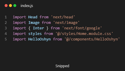
Let’s add this to the home page. We first need to import the component into the homepage:
And then just add the component (<HelloOshyn />) anywhere you want:
Next.js Image component
The Next.js Image component, next/image, is an extension of the HTML <img> element, evolved for the modern web. It includes a variety of built-in performance optimizations to help you achieve good Core Web Vitals scores. These scores are an important measurement of user experience on your website, and are factored into Google’s search rankings.
Some of the optimizations built into the Image component include:
-
Improved Performance: Always serve correctly-sized images for each device, using modern image formats.
-
Visual Stability: Prevent Cumulative Layout Shift automatically.
-
Faster Page Loads: Images are only loaded when they enter the viewport, with optional blur-up placeholders.
-
Asset Flexibility: On-demand image resizing, even for images stored on remote servers.
To make use of this component, you need to import it to your component or page:
import Image from ‘next/image’
Read more about the Image component.
Link component
Client-side transitions between routes can be enabled via the Link component exported by next/link.
To make use of this component, you need to import it to your components or pages:
import Link from ‘next/link’
Example:
<link href=“/“>Home</Link>
Deploy
Build the project. If you check your package.json file, you are going to see something like this:
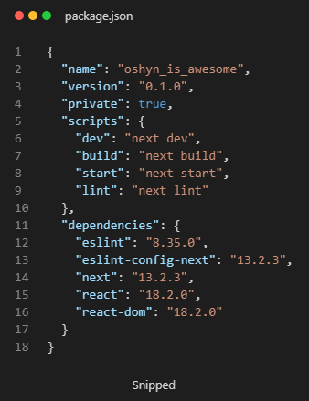
You can see there is a build script. This command is going to build your project the same way Vercel is going to do it to publish it live.
npm run build
This script is going to generate a .next folder with our built project inside it. In order to test our build, we need to run the start script:
npm run start
This will provide a localhost for our built project.
Deploy Project to Vercel
Now let’s get this live:
-
Create a repo on github and push our project there.
-
Create a Vercel account.
-
Add your github account and give all the respective permissions.
-
Add a new project.
-
Find your repo and hit import.

-
Hit deploy.
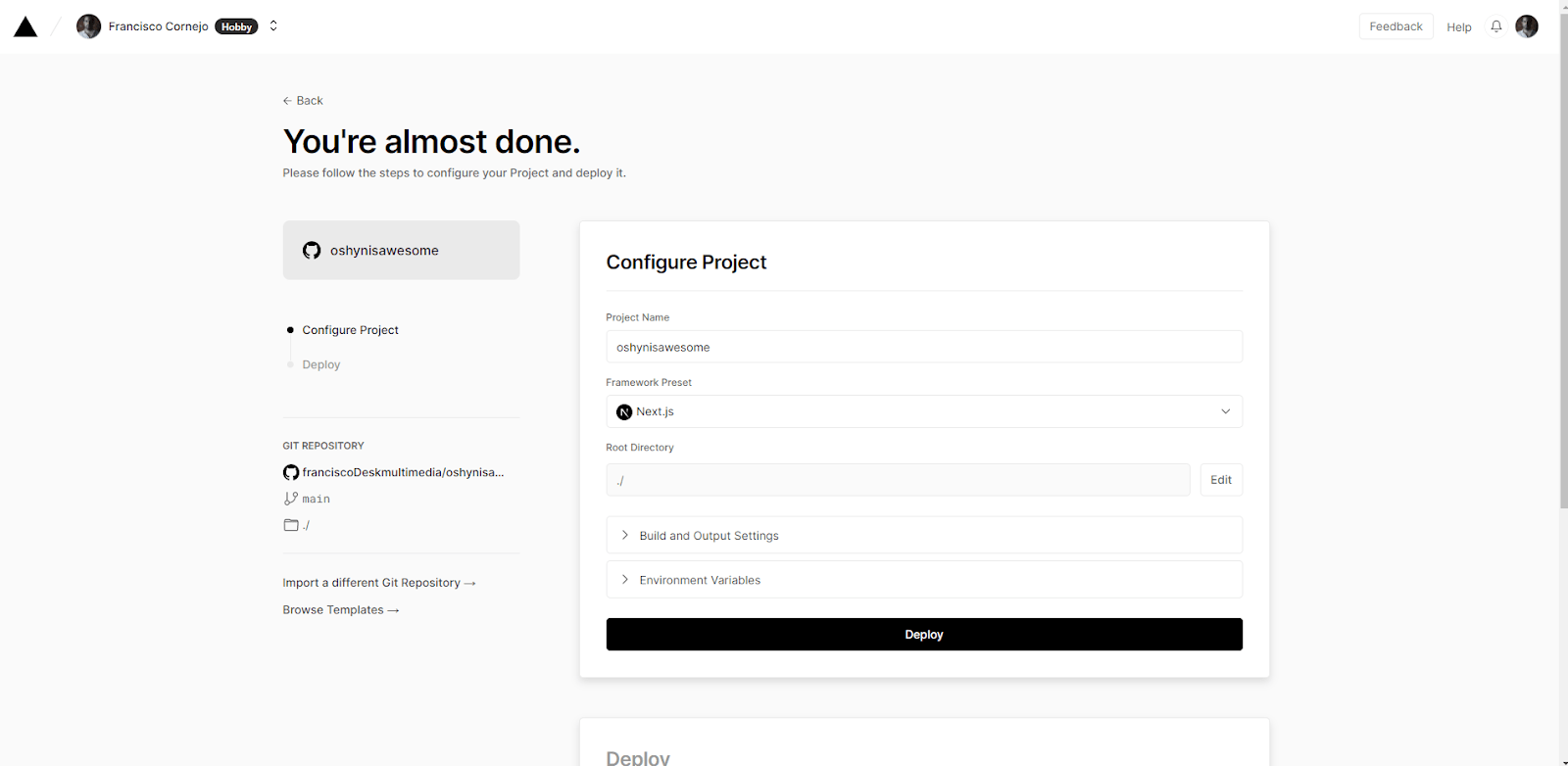
-
Wait a little.
-
Congrats, you’re live!
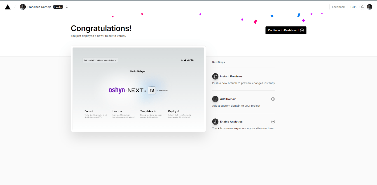
Now, every time you make a push to your repo, Vercel is going to rebuild your project.


