


Jul 18, 2023


What happens when you visit a website or open an app on your smartphone that takes too long to load? Then by the time it does load, an irrelevant popup greets you, or the elements in the navigation bar are complicated and hard to understand.
This happens more often than many brands would like to admit, and the culprit is poor user experience (UX) design.
On the other hand, brands that design a good user experience are often rewarded. Some of the most often-used statistics about UX design focus on the fact that conversion rates can increase by 400% and that every dollar invested in UX yields an ROI of 9,900% ROI. While stats like these depend on several factors, providing a good user experience converts more visitors and leads into customers.
Good UX design reduces frustration and friction for your user, so they can quickly find the action you want them to take. The faster they get there, the lower their chances of abandoning your site. And if you make it a positive experience along the way, their likelihood of ultimately converting is higher.
That’s the big secret to UX success, and in this guide, we’ll explain everything you need to know about UX design, including the principles of UX design, reasons why you need it, and the benefits of focusing on it.
What Is UX Design?
User experience design is a design approach that focuses on creating products and systems that are enjoyable and relevant to your users. It means designing interactions that make sense to them.
UX design is about architecting content (text, graphics, images, layouts, user flows, etc.) to make it easy to navigate and find. It’s about using responsive layouts to display content so that it’s easily digestible for your users, increasing their understanding and likelihood of conversion.
The standard for a good website has risen tremendously, as we alluded to in the introduction. It’s not the 90s anymore when people were happy to wait for a page to load, pixel by painstaking pixel. They expect your website to load fast, feel intuitive, and maybe even be a bit more fun.
For this reason, nearly nine in ten users say they’re unlikely to revisit a website with a poor user experience. That’s why you need strong UX design.
The Role of the UX Designer
UX design is often confused with graphic design; consequently, the role of graphic designers and UX designers is also confused.
A graphic designer designs your brand, print materials, color, and logo. A UX designer takes those elements from the graphic designer and creates a digital experience. While some well-meaning organizations might think they can get away without a UX designer since someone has already designed their logo and defined the brand, the reality is much different.
The UX designer plays a key role in the modern product team as they help to conduct user research, analyze competitors and coordinate with the developer and marketing teams to ensure that all aspects of the user experience and customer journey are engaging, enjoyable, usable, and accessible. For ambitious brands that want to create the best digital experience for their customers, UX design is crucial.
Why Good User Experience Design & Designers Are a Necessity
Good UX design captivates users, enhances brand loyalty, and drives business success. Accomplishing that requires the assistance of experienced UX designers as well. Here are a few reasons why they’re a necessity.
UX Designers Create Experiences That Are Easily Digestible and Distraction-Free
A positive user experience is designed to encourage your customers down the funnel. There are two key ways that strong UX design transforms leads into customers:
1 First, by making it easy for users to take the action you want them to take. A good UX designer will make it easy for your visitors to find your lead form by putting it in the place they expect to click, above the fold. They’ll also design the CTA buttons to have a bright color that contrasts with the rest of your site (while remaining on brand), so your visitors can’t help but click them.
2 Second, by removing obstacles that could distract them along the way. A well-designed landing page removes navigation and links to other pages, so your visitors are not distracted by other places they could go. A savvy UX designer will ensure the purpose of the page is clearly understandable, so your leads have no question about which action they should take next.
What is the ultimate goal of UX design? Making it easy for your visitors to do what you want them to do and removing anything that might distract them from taking that action.
Good UX Design Yields Results
User experience design is about giving your visitors blinders so they go down the exact path you want them to take. UX designers rely on user research, testing, and best practices to make that path as easy as possible while enabling them to trust that they know what they will get when they engage with your site. UX designers can be your catalyst for change. They know how to figure out why you’re not converting and what to recommend to make sure you do.
Principles of UX Design
The four UX design principles are information architecture, user discovery and research, user analytics, and search experience.
1. Information Architecture
Information architecture is a significant part of UX design. It’s all about organizing your content so that it makes sense to your users. When defining information architecture, a UX designer will determine the following:
-
The best order to place menu items in your website navigation
-
How to develop a content tree or hierarchy
-
The optimal URL structure to support that hierarchy
Many people don’t think of organizing information as a UX design concern, but it absolutely is — because it’s all about the user! Placing content in a hierarchy makes your website easier for your users (and search engines) to navigate and explore. A core best practice of UX design is to start with broader ideas and then dig deeper into more complex ideas.
Let’s take an e-commerce website as an example. These websites are typically organized with a homepage at the top, then category pages, sub-category pages, and finally, product pages at the bottom of the hierarchy.
How vital is navigation to your customers and users? The most important, according to a 2021 report by Clutch, where 94% of people say “easy navigation” is a website’s most valuable feature.
What’s the secret to easy navigation? Keeping it simple.
Data shows that menus with more than seven to nine items are less usable because they overwhelm users. Our working memory can only hold so many things at a time, so by keeping it simple, your users will thank you.
2. User Discovery and Research
Don’t let the design in the name fool you; UX design decisions are based on data more than aesthetics. UX discovery consists of interviewing users, performing user testing, and browsing your competitors’ websites to find common trends and best practices.
User research is a core principle of UX design. If, for instance, you run an online shoe store, and the research shows that people are looking for black boots, then a UX designer will not group all of your shoes together by the heel size.
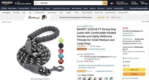
That’s an example of a decision based on user research. UX designers also rely on industry best practices. For example, decades of research show that buttons with contrasting colors get clicked more often, so you’ll often see CTA buttons in a brighter shade than the rest of the website.
Take a look at Amazon. Their website features shades of black, dark teal, and white. On the other hand, their Add to Cart buttons are a bold yellow. Even with all that other text on the page, you can’t miss them:
UX designers don’t guess what your users want. They use data, statistics, and real-world research to determine their needs.
3. User Analytics
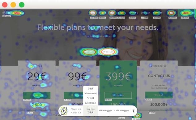
In addition to interviewing your users, UX designers review their click and behavior data to make decisions. They can review your Google Analytics to see your customer’s journey through your website, observing what pages they’re clicking on and how they got there.
Then, on an individual page level, they can use mouse-tracking software to see where your users click and hover on a page. This reveals key insights about their behavior and helps you find mistakes in your design.
For example, your click behavior may show that everyone is trying to click on an icon, even though it’s not clickable. That can signal to your UX designers that they either need to make that icon clickable or swap it with something that makes it clear it’s not clickable. Catching these mistakes is one of the major cost- and time-savings UX designers can offer organizations.
Here’s an example of the heatmap data for a pricing page from the popular mouse-tracking software Mouseflow :
4. Search Experience
When it comes to UX, one of the first things you learn is this:
Don’t put a search box on your page without first thinking through how people will conduct their search and then designing your search results accordingly.
If your users cannot find what they need with your search box, there’s no point in putting it there. First, you must define your search functionality and how you’ll map the results to your content. Working together with your UX designer, you’ll answer questions like:
-
How do you want your search box to look, and where will it appear on your site?
-
How will the search results page function? Will you incorporate visuals or sponsored content?
-
What content is eligible for search? Everything? Blogs or product pages?
-
What search features will you use (e.g., faceted, type-ahead, natural language)?
-
How will the results be weighted for relevance? (e.g., if you’re an e-commerce site and people search for a specific product by name, the results should take them directly to the product page, not a random blog article that happens to mention that product)
Refining your search experience is an often overlooked but essential aspect of UX design, as many people navigate solely using search. In fact, one study found that 21% of websites are navigated exclusively utilizing the search feature.
How User Experience Design Works
Within UX design, there are three core phases of work: strategy, design, and implementation. Each core phase has a set of sub-tasks and processes that work together to provide businesses with the best UX design. After gaining a preliminary understanding of your project, your UX design team will recommend an approach and list of specific sub-tasks for your project.
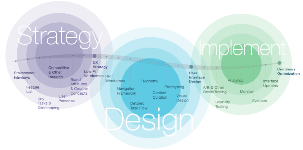
Strategy
The first UX design phase, strategy, will set the baseline for your user experience. Your typical process will start with stakeholder interviews and work sessions, which help your UX design team better understand your business.
During these work sessions, your UX design team will also brainstorm high-level ideas with you to better understand your vision for the project. From these work sessions and additional research, your UX design team will consolidate their findings and provide recommendations in the following areas: goals and objectives, value proposition, key features and functions, brand attributes, device approach, personalization, testing, and analytics.
Based upon approved recommendations, the UX team will assemble the final strategy and include your solutions to the requests represented as user personas, a sitemap, critical tasks flow, low-fidelity wireframes, high-level creative concepts, and a project road map.
Design
Once your UX design strategy is complete, the design phase of your project can begin. During this phase, your UX design team will work to define how your digital product works. The first step in this process is to develop detailed high-fidelity wireframes that fill in details missing in their low-fi wireframes predecessors.
These wireframes will also help designers to understand better what actual UI (user interface) elements look like while making it easier to communicate features and functionality with key stakeholders, designers, and developers.
Defining the navigation framework and critical task flows is integral to developing your high-fidelity wireframes. Concurrent with the wireframing process, your team’s UX design creative director will work with you to transition the high-level creative concepts from the strategy phase to visual page designs. This is also the time to start putting your content plan together. Depending on your project needs, prototyping certain features may be necessary to determine feasibility. The outcome from this phase is your complete user interface design and the requirements definition required for the development of your site.
Implementation
Your digital product is now live and available for your users. However, you still need to complete your UX design. The best way to ensure a great experience is to provide a path for your business to learn from interactions and optimize in real-time.
Methods to accomplish this include leveraging built-in analytics to learn from interactions from page views, site use patterns, and responses to A/B, user, and other forms of onsite testing. A key part of this analysis is looking at your users’ conversion and retention rates and any direct input from users.
Benefits of Effective UX Design
UX design may seem like a complex and lengthy process. However, the UX design process can be expedited if you work with the right UX design team and take an organized approach. Plus, you will realize the benefits of your new user-centered design (a design focused on validated user needs and best practices instead of business owners’ likes and dislikes).
Lower cost of acquisition
A good UX design will ensure that users can find what they need, convert and return — on their own, without intervention. Less intervention equals a lower cost of acquisition.
Reduced support costs
Users that can find what they want on your site need less help, lowering your need for customer service representative intervention.
Increased customer retention
The goal of UX designers is to build user trust. Their entire design is developed to make your users feel more comfortable and trusting of your organization, making them more likely to fill out your lead form or add something to their cart. That trust pays off in higher customer retention rates since satisfied users return and buy more.Satisfied users share the news with their friends, which brings in more customers and sales.
Increased ROI
With proper UX design, brands can increase their conversion rates. This leads to an increase in revenue and a higher return on investment.
Lower bounce rates
When users aren’t frustrated, they’re much more likely to meander down the path you want them to take. Good UX design eases their path to purchase, preventing site and cart abandonment.
Achieving Long-term Success With Oshyn’s UX Design Services
The best UX design is one that’s constantly iterating. User experience design is not a one-and-done process. UX designers continuously check and recheck your user data, test new designs, and refine their recommendations to ensure that your leads have the journey you expect.
Just as technology is constantly evolving, so are your users. Having an experienced UX designer on your side can help your organization ensure that you keep up with their needs and expectations.
As a digital agency with experience helping global brands create engaging digital experiences, Oshyn provides the support you need to design the best website for your customers. With our expertise in leading DXP solutions such as Sitecore, Adobe, and Optimizely, we know the tools and technologies you need to build the perfect user experience. Contact us today to start designing the right user experience for your customers.
-
-

 Kimberly McCabe
-

-

 Oshyn
Oshyn
How to Select a Tech Partner
A Complete Guide for Marketers

This site is protected by reCAPTCHA and the Google Privacy Policy and Terms of Service apply.