Introduction to Responsive Web Design


Feb 19, 2013
What is Responsive Web Design?
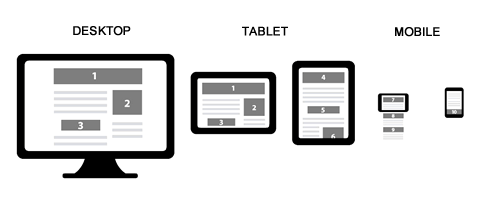
Responsive Web Design (RWD) allows designers to create websites with fluid layouts and flexible images that automatically adapt according to the size and orientation of the users browser to deliver the optimal layout. This means your site looks great and is consistent, regardless of how people are accessing it. RWD allows you to be confident that your website will deliver a fantastic web user experience on any device.
For example, if you design your website with a desktop computer in mind and somebody visits your website from a mobile device, they will most likely find the resolution less than optimal. This means developers then have to design a mobile version of your site, which means that you have to have build and maintain two different websites which means more work.
RWD lets you give the user with the big monitor a big website while at the same time giving the user with a small monitor a smaller website, without cutting out content or features.
The key is not changing the HTML, but adding different CSS styling.

The Elements of Responsive Web Design
- Media Queries
Using media queries lets you detect the resolution of the browser where we can resize the elements to fit in the screen.
@media screen and (max-width:600px){} - The Fluid Layout
The fluid grid concept calls for page element sizing to be in relative units like percentages or EMs, rather than absolute units like pixels or points. This means the site will adapt to any device you are using. - Flexible Images
Flexible images are also sized in relative units (up to 100%) to prevent them from displaying outside their containing element.
Recommended Frameworks for Responsive Web Design
Recent Insights
-
BLOG

 Diego Rebosio
Takeaways From Adobe Summit 2026
Agentic AI and Brand Visibility
-
BLOG

 Daniela Romero
Content Authoring in Adobe Edge Delivery Services
In-context Authoring vs. Document-Based Authoring
-
BLOG

 Diego Rebosio
Is Your Brand Ready for the Robot Buyer?
Why AI-First UX is the New Digital Frontier
-
BLOG

 Christian Burne
Why Agentic DXP Development is the Future of Enterprise Web


