Introduction to Sitecore Mobile Web Development


Jan 03, 2013


Sitecore’s robust platform is built with the flexibility to easily create a mobile experience for website visitors. With device detection to know if your visitors are coming from their smartphones, tablets or desktops, Sitecore offers a simple way for web editors to maintain all website versions from one interface. According to Digital Trends, global mobile traffic is growing rapidly to include 13% of all internet traffic. This is why it’s more important than ever to maintain a mobile website for your brand. Recently I had the opportunity to use Sitecore while building a site for mobile devices.
If you already have a website built on Sitecore, half of your mobile site is already built. Depending on your mobile site requirements, you could potentially have a lot business logic that could be reused to build your mobile site. You will still need to provide a user interface design according to mobile device capabilities and network limitations. This means a layout system to support smaller displays, use small size images, adaptive layout structure to portrait or landscape positions of the device, among others.
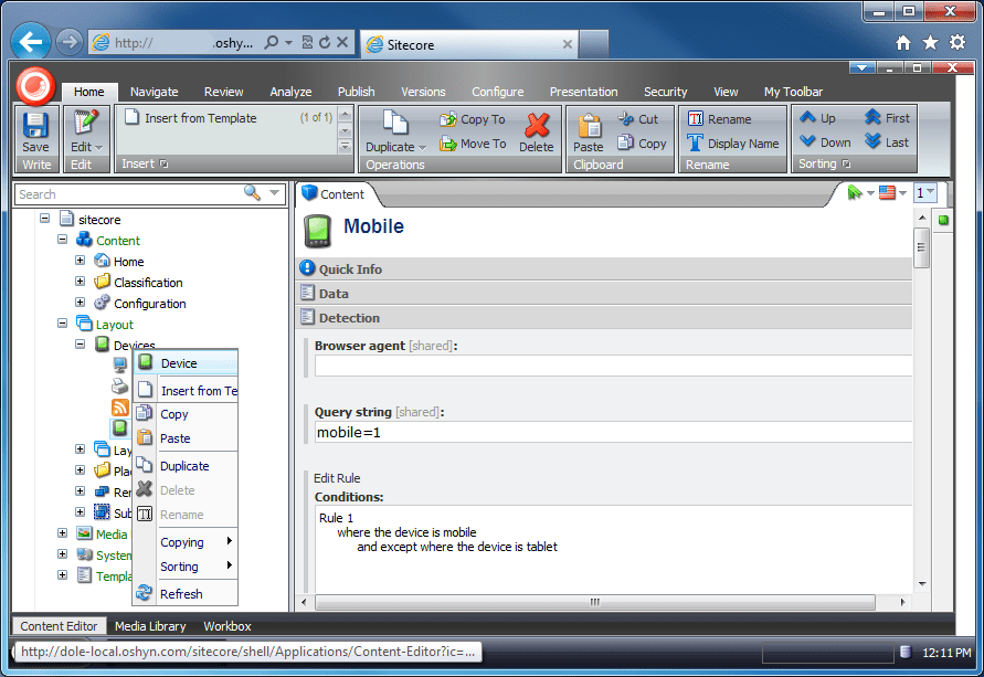
Sitecore offers you a layout system that considers a schema to bring an appropriate response if the request was made from a mobile device. As you can see in the next screenshot, you could define as many devices as you want by filtering according to the browser agent.
If you have some experience developing with Sitecore you know that a best practice is to separate the components of a page into modules that you could reuse through the website, even between device versions of the site if the module is appropriate. However you may have to separate different layouts for desktop site and mobile site to provide the best experience to either one.
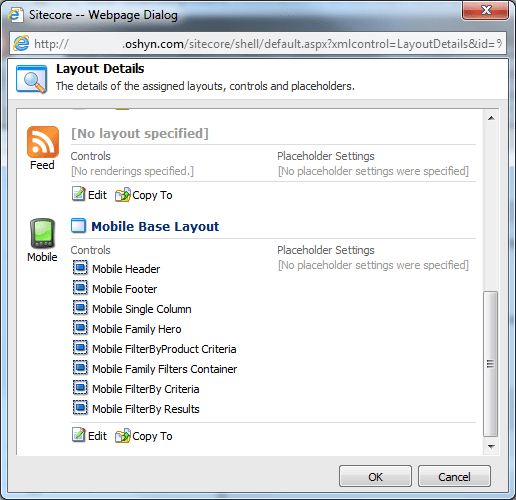
Once your layouts for mobile have been defined, it is necessary to add them to page templates. For example: think about which existing components you could use on your mobile site. Many small components, like a newsletter subscription module or auto-complete filter of products module, could be reused — of course, you need to provide different styles which can be done using different header modules for desktop and mobile that use different files for CSS. In the next screenshot, you can see the different mobile modules added to a page template that use a specific header for mobile.
For a desktop site, you could have a base layout as follows:
<%@PageLanguage="C#"AutoEventWireup="true"
CodeBehind="Base Layout.aspx.cs"
Inherits="Sample.Sitecore.Web.layouts.Master.Base_Layout" %>
<!DOCTYPEhtml>
<htmllang="en">
<headrunat="server">
    <metacharset="utf-8">
    <title>Sample |
        <%=pageTitle%>
    </title>
    <metaname="viewport"content="width=device-width, initial-scale=1.0">
    <!-- Le styles -->
    <linkhref="/css/bootstrap.css"rel="stylesheet"media="screen, print">
    <linkhref="/css/main.css"rel="stylesheet"media="screen, print">
    <linkhref="/css/jquery.rating.css"type="text/css"rel="stylesheet"
	 media="screen"/>
    <linkhref="/css/print.css"rel="stylesheet"media="print">
…
A mobile site’s layout has style references and scripts that help support mobile device requirements, like adaptation to device display, landscape and portrait modes, etc.:
<%@PageLanguage="C#"AutoEventWireup="true"
CodeBehind="Mobile Base Layout.aspx.cs"
    Inherits="Sample.Sitecore.Web.layouts.Master.Mobile_Base_Layout" %>

<!DOCTYPEhtmlPUBLIC"-//W3C//DTD XHTML 1.0 Transitional//EN"
"http://www.w3.org/TR/xhtml1/DTD/xhtml1-transitional.dtd">
<htmlxmlns="http://www.w3.org/1999/xhtml">
<headrunat="server">
    <title>Sample - Home</title>
    <metaname="viewport"content="width=device-width, initial-scale=1">
    <linkrel="stylesheet"href="/mobile/css/jquery.mobile-1.2.0.css"/>
    <linkrel="stylesheet"href="/mobile/css/main_mobile.css"/>
    <linkrel="stylesheet"href="/mobile/css/bootstrap.css"/>
    …
With this, you could begin to build a mobile web version of your current site. However, you’ll need to take several things into consideration:
You need to provide a web design of your mobile site before you build the mobile version.
You need to define which components will be shared for the two versions of the site considering the information to be displayed and if the design is similar to both cases.
It's better to use different images for mobile site, smaller images will improve the performance. If you need to share images for both sites, you need to consider where the image will be displayed and its proportions (height and width) to avoid distort.
Note: This post doesn’t take into consideration responsive design that you could use to provide a different presentation for your site when is visited through a mobile device, that’s other topic. J
-
BLOG

 Christian Burne
3 Web Project Mistakes We See Over and Over
(And How the Best Teams Avoid Them)
-
BLOG

 Gabriel Baldeon
Getting Started with Sitecore Blok
Building a Next.js App with AI Assistance
-
BLOG

 Fernando Torres
The Silent Killer of Performance
Why We Need to Stop Underestimating CSS
-
BLOG

 Patrick Wirz
Oshyn at Adobe Summit 2026
Elevating the Experience
This site is protected by reCAPTCHA, and our Privacy Policy applies.