Best Practices for Testing Websites on Mobile Devices


Feb 14, 2017
Increasingly, many people access the internet and browse web pages from their mobile devices. The variation in mobile devices is vast and still growing. This is why it is really important that a website has been properly tested for a variety of devices before any changes go live, so that users will have a positive user experience with a friendly navigation that is consistent between computer, phone, and tablet. There are formal website testing processes that serve as quality control measures used to verify that a website works as expected, in this case on mobile devices.
When testing a website in mobile version, is important emphasize that the mobile screens are much smaller than your desktop and tablets. Different sized screens necessitates different sized websites. For fitting in smaller screen is necessary to create the smallest version.
There is a fundamental set of best practices for QA testing on mobile:
- Test with a goal mind: The tester must validate the website and check if it meets all specifications and requirements so that it can achieve the pre-defined business requirements.
- Define a testing strategy: Plan and create a testing strategy that will help all the testers in the company maintain rules and standards to ensure testing quality and consistency.
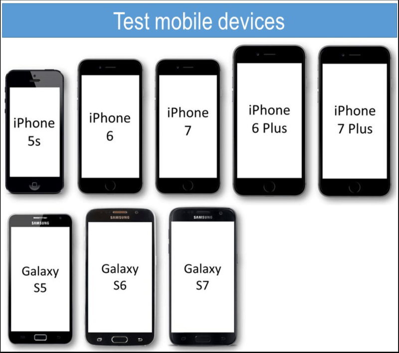
Planning tests that will be carried out by the Testing team to the different deliveries, establishing the set of services to be applied in each sprint according to the technology, state, criticality and urgency of the same. - Define the mobile devices to test: The testing time is limited, therefore Its important to define which mobile devices should be part of the tests.
The list must be based on what your current user patterns are and which mobile devices make up most of your traffic.

- Test on real devices: The tester can support their tests with emulators, but they do not always reflect exactly what the visitors will see. Testing on physical devices will give us the real scenario that the visitors will see. On mobile devices, the tester can look at gestures like tapping, pinch-to-zoom, portrait, landscape, or finger swipes.
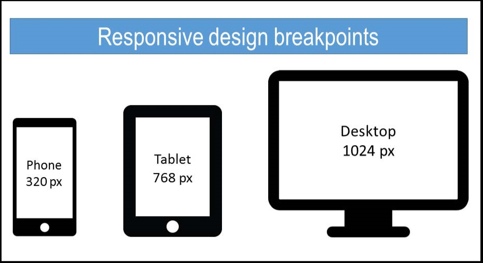
- Breakpoints: It is important to define your own breakpoint according the content and design, enlarging and collapsing the browser window to decide how and when to add a breakpoint. Each breakpoint requires an adaptation of the layout, with modules that change their position and rules. While testing the website, we might find that is necessary to add breakpoints for certain sizes that were not contemplated in the design. There are so many shapes and sizes of mobile devices that we can not create a breakpoint for all of them.

- Define expected results: You should know what to expect at the end of each test. In this way It is clear to which scenario each test is linked. The testers must be aware of all the changes made during the sprint so that they can update the test cases and do regression testing according the new changes.
- Performance and load speed test: Measure the scalability and adaptiveness of the website. Test the website performance on different internet connection types: wifi and 4G. Check performance also for when you go on and off local networks. The website should be able to handle many concurrent user requests, heavy load on specific pages, and large input data from users.
- Content of Pages: Prioritize the relevant content for visitors. The testing must focus on checking the spelling errors, checking that images have been placed properly with proper sizes in different mobile devices, checking if the copy is too long, and checking the typography. In general, the site's readability must be clear and never affect the small devices.

- Input Methods.The user experience using the fingers instead of the mouse and keyboard are quite difference The tester must check the buttons and clickable areas are working as desired on each device, the same as the forms to be filled out.
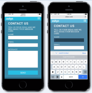
Regarding forms, it is important to consider some aspects when testing: in-line validation, address validators, auto-complete functionality, drop-down sizes and selections, the help and hint text on each device. Check the validations on each field, default values, wrong inputs, and the error messages to make sure that they display correctly and are readable on different mobile devices.

These are just some important practices to keep in mind while testing on mobile devices, though there are more to consider.
As a final piece of advice, make sure you remember that each website has its own goal and budget. As testers we are responsible for fulfilling the objectives for the website, which includes a reliable and satisfying performance for users navigating it on a variety of mobile devices.
Recent Insights
-
BLOG

 Daniela Romero
Content Authoring in Adobe Edge Delivery Services
In-context Authoring vs. Document-Based Authoring
-
BLOG

 Diego Rebosio
Is Your Brand Ready for the Robot Buyer?
Why AI-First UX is the New Digital Frontier
-
BLOG

 Christian Burne
Why Agentic DXP Development is the Future of Enterprise Web
-
BLOG

 Daniela Romero
Building an AEM Headless Site Without Using EDS
How to Build Headless Applications with AEM GraphQL and Content Fragments


